主题
什么是主题
主题是由很多个自定义表单组件组成的对象或 npm 包
- 主题对象
- 主题npm包
//自定义number组件
import { numberField } from './numberField'

//导出自定义主题 自定义主题名为customTheme
export default {
  //自定义number组件的type类型是number(type类型随意取,保证和unitedSchema中ui.type一致即可)
  number: numberField,
  // 自定义主题名字,随意取
  theme: 'customTheme',
}@jdfed/drip-form-theme-antd:适配 antd v4 版本的主题包
主题可以提升自定义组件的复用性
用户可以针对业务场景、组件 ui 库等开发不同的主题
自定义主题
自定义主题的使用场景
有如下场景时,可以开发自定义主题。
- 开发的自定义组件较多,希望统一引入所有自定义组件;
- 开发的自定义主题可以跨业务使用;
- 开发的自定义组件需要在数组容器中使用;
- 开发的自定义组件非定制场景,存在复用可能性;
如何开发自定义主题
查看自定义主题文档
如何使用主题
Drip Form 支持全局设置所有表单控件使用的主题,也可以指定全局主题后再单独设置表单控件使用的主题。
Drip Form中可以导入一个或多个主题。
单主题:只导入一个主题;
多主题:导入多个主题
单主题
代码示例
- App.tsx
- unitedSchema.json
import DripForm from '@jdfed/drip-form'
import antd from '@jdfed/drip-form-theme-antd'
import unitedSchema from './unitedSchema'
import '@jdfed/drip-form/dist/index.css'
import '@jdfed/drip-form-theme-antd/dist/index.css'
import 'antd/dist/antd.css'

function App() {
  return (
    <DripForm
      // 表单配置文件
      unitedSchema={unitedSchema}
      // 导入antd主题
      uiComponents={{ antd }}
    ></DripForm>
  )
}

export default App
unitedSchema.json
{
  "type": "object",
  "showError": "change",
  // 全局主题使用antd
  "theme": "antd",
  "schema": [
    ...
  ]
}
多主题
代码示例
- App.tsx
- customTheme/numberField.tsx
- customTheme/index.ts
- unitedSchema
/**
 * 多主题例子
 * 优点:组件可以重复使用,并且主题可以单独发布npm包,跨业务使用。
 */
import DripForm from '@jdfed/drip-form'
import antd from '@jdfed/drip-form-theme-antd'
import unitedSchema from './unitedSchema'
import customTheme from './customTheme'
import '@jdfed/drip-form/dist/index.css'
import '@jdfed/drip-form-theme-antd/dist/index.css'
import 'antd/dist/antd.css'

function App() {
  return (
    <DripForm
      // 表单配置文件
      unitedSchema={unitedSchema}
      // 导入antd主题和自定义主题customTheme
      uiComponents={{ antd, customTheme }}
    ></DripForm>
  )
}

export default App
/**
 * 自定义nubmer组件
 */
import { memo } from 'react'
import { InputNumber } from 'antd'
import { useField } from '@jdfed/hooks'
import { CommonProps } from '../global'

const NumberField = ({
  onChange,
  fieldData,
  fieldKey,
  dispatch,
  getKey,
  formMode,
  ...restProps
}: CommonProps) => {
  const _onChange = useField({ fieldKey, onChange, getKey }, dispatch)
  // view 查看模式
  if (formMode === 'view') return fieldData || null
  // edit 编辑模式
  return <InputNumber onChange={_onChange} value={fieldData} {...restProps} />
}

export const numberField = memo(NumberField)
/**
 * 导出自定义主题 customTheme
 */
import { numberField } from './numberField'

export default {
  number: numberField,
  // 自定义主题名字,随意取
  theme: 'customTheme',
}
// 表单配置文件

export default {
  type: 'object',
  showError: 'change',
  ui: {},
  // 设置全局主题为antd
  theme: 'antd',
  schema: [
    {
      type: 'string',
      title: '输入框',
      ui: {
        // 不配置theme,默认使用全局主题 antd
        type: 'text',
        style: {
          width: '100%',
        },
      },
      fieldKey: 'text_5oOHZr',
    },
    {
      type: 'number',
      title: '数字输入框1',
      ui: {
        // 使用自定义主题 customTheme
        theme: 'customTheme',
        type: 'number',
        description: {
          type: 'text',
          title: '第一次使用customTheme主题的number自定义组件',
        },
      },
      fieldKey: 'number_lAjBzU',
    },
    {
      type: 'number',
      title: '数字输入框2',
      ui: {
        // 需要和自定义主题名字一致
        theme: 'customTheme',
        type: 'number',
        description: {
          type: 'text',
          title: '第二次使用customTheme主题的number自定义组件',
        },
      },
      fieldKey: 'number_QmKL9J',
    },
  ],
}
代码沙盒:
QA
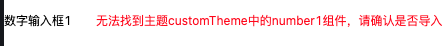
使用了主题中不存在的组件会有什么效果
如下图所示:使用了不存在自定义组件,渲染时会有错误提示。
提示
使用 options prop可以控制当使用未定义的组件的渲染逻辑和报错逻辑,详情查看:options prop
代码沙盒: