表单展示
通过下面图片来了解Drip Form表单控件的组成部分
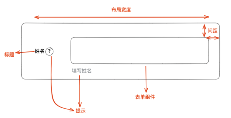
表单展示可以分为几个部分:标题、提示、表单组件、布局
Drip Form通过ui对象来描述表单提示信息、表单控件信息;
通过title字段来描述表单标题
上面组件使用 unitedSchema 协议描述如下:
{
  //最外层是对象类型
  type:'object',
  //数据变化时触发校验
  validaTime:'change',
  //全局默认使用antd主题
  theme:'antd',
  schema:[
    {
      //表单数据类型
      type:'string',
      //标题
      title:'姓名',
      ui:{
        //使用antd主题的text控件
        type:'text',
        //当前表单控件使用antd主题(若和全局使用的theme一致,则可省略)
        theme:'antd',
        //当前表单控件使用编辑模式
        formMode:'edit'
        //提示信息
        description:[
          {
            type:'icon',
            title:'这是姓名'
          },
          {
            type:'text',
            title:'填写姓名'
          }
        ],
        //表单布局描述信息
        containerStyle:{
          width:'100%'
        }
      },
      //数据绑定
      fieldKey:'name'
    }
  ]
}
上面JSON 高亮部分描述了表单控件的标题、提示、表单控件类型、表单所使用的主题信息。
常见配置
表单组件主题(theme)
theme字段用来描述当前表单控件的主题。提示uiComponents中导入的主题均可使用。
//导入drip form渲染核心
import DripForm from '@jdfed/drip-form'
//导入antd主题
import antd from '@jdfed/drip-form-theme-antd'
//导入表单配置文件
import unitedSchema from './unitedSchema'
//导入drip form样式
import '@jdfed/drip-form/dist/index.css'
//导入antd主题样式
import '@jdfed/drip-form-theme-antd/dist/index.css'
//导入antd样式
import 'antd/dist/antd.css'

function App() {
  return (
    <DripForm
      // 表单配置文件
      unitedSchema={unitedSchema}
      // 导入组件
      uiComponents={{ antd }}
      // 设置表单值
      formData={{
        checkbox: '1',
        colorPicker: '#000000',
        text: '1111',
        number: 1,
      }}
    ></DripForm>
  )
}

export default App
Drip Form支持导入多个主题,并使用不同主题的不同表单控件。
详细参考 主题
表单组件类型(type)
type字段用来描述当前字段的表单控件类型。
主题包含了多个表单控件,选定使用主题之后,需要确定使用的控件类型。
以 antd 主题为例,antd 支持以下控件
| type 类型 | 组件名 | 预览 |
|---|---|---|
| text | 文本输入 |  |
| number | 数字输入 |  |
| select | 选择器 |  |
| cascader | 级联选择器 | 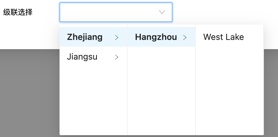 |
| colorPicker | 颜色选择器 |  |
| datePicker | 日期选择框 |  |
| timePicker | 时间选择框 |  |
| radio | 单选框 |  |
| checkbox | 多选框 |  |
| slider | 滑动输入条 |  |
| switch | 开关 |  |
| uploader | 上传 |  |
| transfer | 穿梭框 | 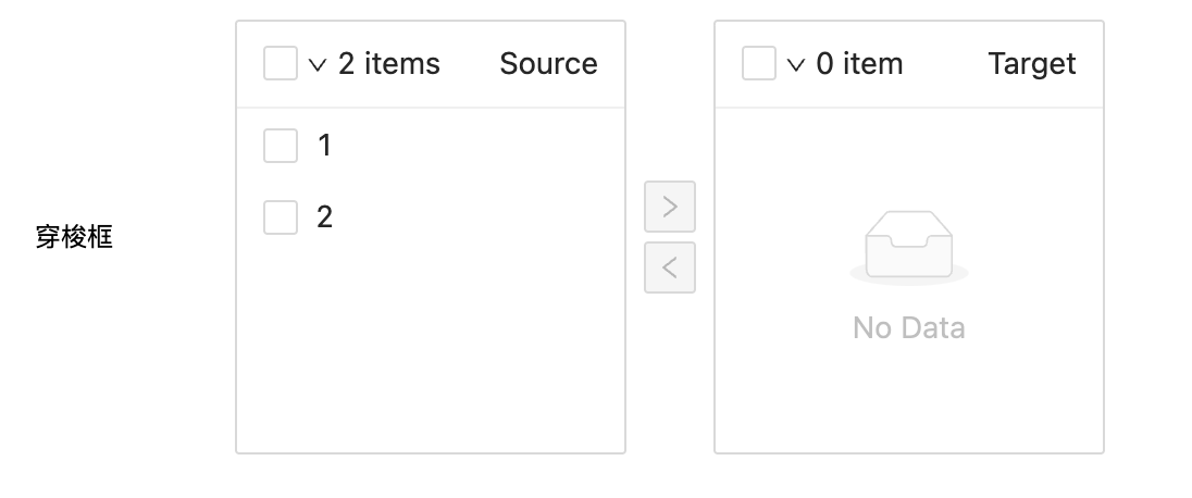 |
| null | 文本 |  |
| array | 数组容器 | 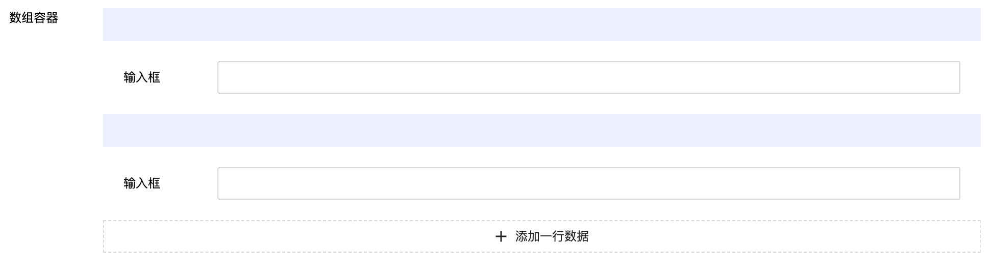 |
| object | 对象容器 | 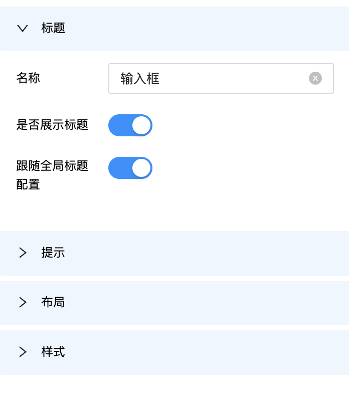 |
标题(title)
title字段用来描述当前表单的标题
Drip Form针对标题有多个配置项(查看高亮部分)
{
  //最外层是对象类型
  type:'object',
  //数据变化时触发校验
  validaTime:'change',
  //全局默认使用antd主题
  theme:'antd',
  schema:[
    {
      //表单数据类型
      type:'string',
      //标题
      title:'姓名',
      ui:{
        //使用antd主题的text控件
        type:'text',
        //当前表单控件使用antd主题(若和全局使用的theme一致,则可省略)
        theme:'antd',
        //标题配置
        title: {
          // 是否展示标题
          showTitle: true,
          // 必填是否展示*号
          requiredIcon: false,
          // 标题后面是否展示冒号
          showColon: false,
          // 标题宽度
          width: 82,
          // 标题位置 'left' | 'right' | 'bottom' | 'top'
          placement: "left",
          // 标题字号
          fontSize: "12",
          // 标题颜色
          color: "#000000",
          // 标题文字水平对齐方向 right | left | center
          textAlign: "left",
          // 标题文字垂直对齐方向 top | center | bottom
          verticalAlign: "center"
        },
        //提示信息
        description:[
          {
            type:'icon',
            title:'这是姓名'
          },
          {
            type:'text',
            title:'填写姓名'
          }
        ],
        //表单布局描述信息
        containerStyle:{
          width:'100%'
        }
      },
      //数据绑定
      fieldKey:'name'
    }
  ]
}
提示(description)
description字段描述表单提示信息
提示在表单控件中分两种形式:
下方文字直接展示
{
  ui:{
    description: {
      type:"text",
      title:"下方文字直接粘腻"
    }
  }
}
icon按钮悬浮或点击展示(默认悬浮展示提示)
{
  ui:{
    description:{
      type:'icon',
      title:'按钮悬浮展示',
      trigger:'hover'
    }
  }
}
typescript
type DescriptionItem =
  | {
      type: 'icon'
      title: string
      trigger?: 'click' | 'hover'
    }
  | {
      type: 'text'
      title: string
    }
  | null
export type Description = DescriptionItem | Array<DescriptionItem>
布局(containerStyle)
containerStyle字段描述表单布局信息
Drip Form使用flex布局,默认组件一行一个(宽度100%)。
用户可更改containerStyle来修改组件宽度达到一行多个表单的效果。
typescript
export type ContainerStyle = Partial<{
  // 表单宽度
  width: number | string
  // 容器margin-top
  marginTop: number | string
  // 容器margin-right
  marginRight: number | string
  // 容器margin-bottom
  marginBottom: number | string
  // 容器margin-left
  marginLeft: number | string
  // 容器margin
  margin: string
  // 容器padding
  padding: string
  paddingTop: number | string
  paddingBottom: number | string
  paddingRigth: number | string
  paddingLeft: number | string
}> | null
特殊配置
展示模式(formMode)
Drip Form表单以下两种常用模式
edit编辑模式 (用户可修改表单数据)view查看模式(只读,不可修改数据)
type FormMode = 'edit' | 'view'
不是所有的表单控件都支持formMode配置,取决于表单控件是否有相应模式的实现。
支持展示模式的表单控件
若除了以上的表单希望支持展示模式,欢迎贡献,让Drip form支持更多的组件支持formMode模式。
展示隐藏(vcontrol)
vcontrol可以按照条件控制表单展示、隐藏。
详细了解展示隐藏章节
组件选项(queryConfig)
在组件第一次加载时,可以配合 fetchApi 调用接口,并将后端数据映射到ui对象中。
自定义配置
容器自定义className (customClassName)
customClassName 会被加载到表单容器的class上, 每个表单单项拥有自己的独立ui.customClassName
如果当前容器是数组array类型, 容器的数量会根据formData中数据的数量展示多项, 每项的className相同,如果需要区分可以根据数组索引进行区分
样式(表单组件其余属性)
ui中其余字段会透传给表单控件。
antd组件支持的prop均可以在ui对象中填写。(具体参考antd 各组件prop)